TL;DR: Network topology gets unreadable as it grows, because one diagram is asked to answer four structural questions at once. The fix is to separate them: each view answers one question (physical wiring, L3 segmentation, workloads, or application dependencies) and hides the rest, with C4-style zoom that falls out of expand and collapse.
Mapping tools demo on small networks. A router, two switches, a dozen hosts, a tidy diagram. Then someone points it at a real network, and every host, subnet, and service dependency lands in the same view. The tidy diagram turns into a wall of boxes and links you have to hunt through.
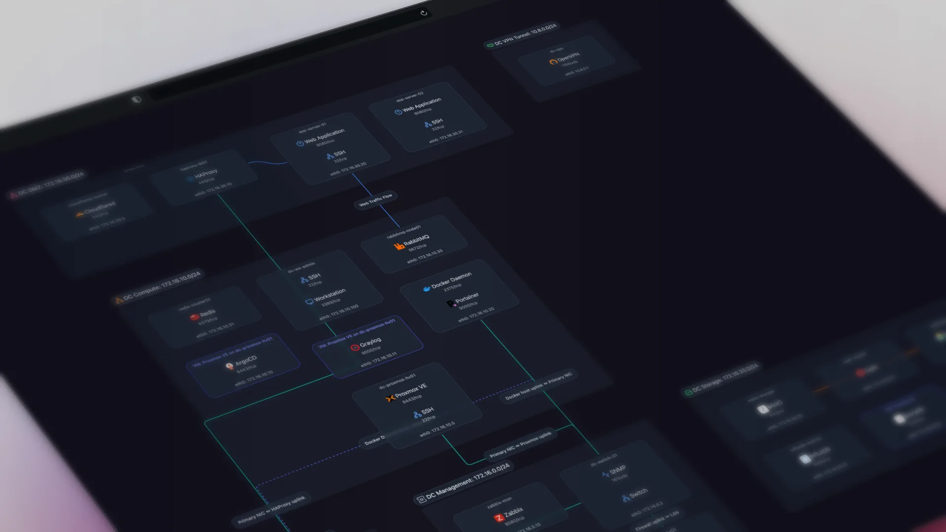
We build Scanopy, a tool that discovers network topology over SNMP, LLDP, CDP, and ARP, and draws it. Our original view put everything it discovered in one diagram: physical links, subnet membership, service dependencies. It was fine on a small network. As networks grew it stopped being readable, and users told us the same thing in different words: I can't read this, and I want to see it a different way.
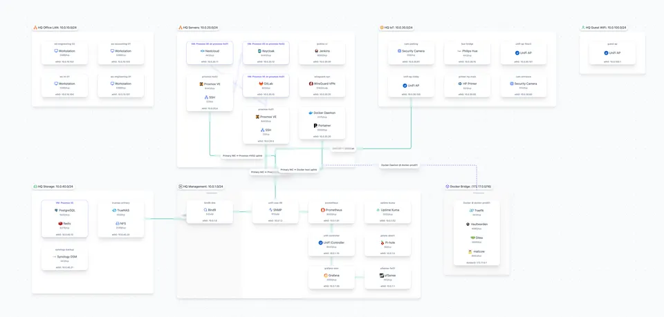
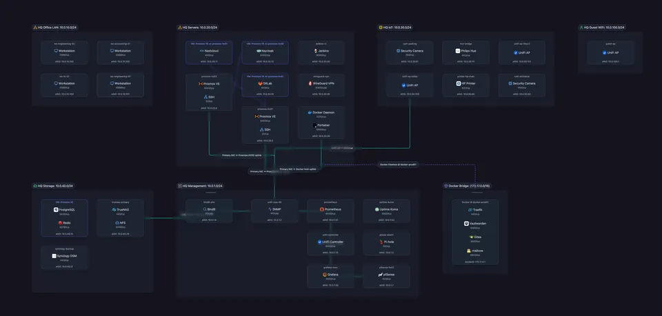
The visualization field settled the underlying question decades ago, and the established network tools already separate these views. Scanopy shipped a single combined view until v0.16; the rewrite brought it in line, plus a few decisions specific to our data.
Why One Diagram Can't Answer Four Questions
Network topology is at least four different graphs over the same nodes:
- Physical (L2): which port connects to which, from LLDP/CDP neighbor discovery.
- Logical (L3): which hosts sit on which subnets, and how subnets reach each other.
- Workloads: which host runs which services + whether those services are containerized or running in VMs
- Applications: which service talks to which as part of different application stacks.
A single host appears in all four graphs, connected by relationships that mean completely different things. The switch uplink that dominates the physical view is irrelevant when you're asking "what breaks if I decommission this database." The subnet boundary that structures the logical view carries no information about cabling.
Draw all four at once and the layout algorithm has to satisfy four structural questions simultaneously. It satisfies none of them. This is not a rendering problem you can style your way out of. It is a data modeling problem.
Edge Crossings Are the Strongest Predictor of Graph Reading Errors
Two findings from the graph-drawing literature drove the redesign.
Edge crossings are what make a graph hard to read, so minimize them. Purchase (2002) found that minimizing edge crossings is the strongest single aesthetic factor in graph readability, ahead of angular resolution or edge-length uniformity; Huang, Hong, and Eades (2006) found crossings are the strongest predictor of reading errors. People don't just find cluttered graphs ugly; they read them wrong. What we did with it: give each view a single structural edge type to lay out, so there are fewer edges to cross, and run a crossing-reducing layout (the Sugiyama method, below).
A display has a limited budget of visual channels, so don't overload one view. Colin Ware's book Information Visualization: Perception for Design makes the point that line style, color, thickness, and direction can only carry so much before they interfere. What we did with it: rather than stack physical links, subnet membership, and service dependencies in one view at equal weight, we split them across views and made secondary edges opt-in overlays.
The established tools separate these views too. NetBox models physical cabling (DCIM) separately from IP and VLAN structure (IPAM), and leaves topology rendering to plugins. SolarWinds ships separate L2 and L3 mapping modes from a single scan. LibreNMS builds its L2 map from CDP/LLDP and ARP.
That left three questions: how many views, what defines each one, and what happens to all the edges that don't fit.
C4's Four Zoom Levels Map Onto Expand and Collapse in Any View
Simon Brown's C4 model solves a parallel problem for software diagrams: one architecture, different questions at different zoom levels. Context, Container, Component, Code. Each level is a complete diagram at one scale, and you move between levels instead of cramming scales together.
Networks map onto it cleanly:
| C4 level | Software meaning | Zoom level in any view |
|---|---|---|
| Context | Systems and users | Every top-level container collapsed to a single node with a count badge. The whole network in one screen. |
| Container | Deployable units | Containers expanded, their members visible inside. |
| Component | Parts inside a container | Individual leaf entities: hosts with their ports, services, addresses. |
| Code | Class-level detail | Everything about one entity, in a side panel. |
What a "container" actually is depends on the view: a host in the L2 view, a subnet in the L3 view, an application group in the applications view. The zoom level controls how much is expanded, not what the nodes represent.
Zoom level and view type are orthogonal. A view (physical, logical, workloads, applications) decides what the nodes and containers represent; the C4 level decides how much is expanded. Any view can be read at any level.
This needed almost no new UI. We didn't build a "C4 mode". We built three composable features that produce all four levels:
- A view switcher (what am I looking at)
- Expand/collapse on containers (Context and Container)
- A detail panel on click (Component and Code)
Users move between zoom levels without ever seeing the term C4.
Only One Structural Edge Type Drives Layout in Each View
Hierarchy drives layout. Cross-cutting relations are drawn on top of it afterward.
Every edge type in Scanopy is classified per view. Some edges drive layout: the engine positions nodes to minimize crossings among those edges only. The rest are context, drawn after layout, off by default, thinner and dashed. The classification is stored in the backend's per-view edge config, so the classification is per view.
How each view contains its entities, and which edges drive its layout:
| View | How entities are contained | Edges that drive layout | Edges available, but not driving layout |
|---|---|---|---|
| Physical (L2) | Interfaces nested in their host | Physical links (LLDP/CDP neighbors) | - |
| Logical (L3) | IP addresses nested in their subnet | Same-host and container-runtime links | Physical links (hidden), dependency flows (dashed) |
| Workloads | Services and VMs nested in their host | None | Physical and dependency links (hidden) |
| Applications | Services grouped into application groups | Dependency edges, within a group only | - |
The layout-driving edge types are kept to the minimum each view needs (a single physical-link type in L2, none at all in workloads), because crossing count grows with edge density. A second structural edge type means more edges competing in one layout, and more crossings, which is what the crossing research ties to misreads. Optimizing placement for one structural question at a time keeps each layout tuned to that question instead of compromising between two.
Two supporting rules:
Containment replaces edges wherever the relationship is parent-child. A VM drawn inside its hypervisor's container needs no connecting line. An IP address inside its subnet needs no membership edge. Nesting shows the relationship spatially, with no added edge. Every edge you don't draw is crossings you don't create.
Overlays are off by default, and collapsing aggregates them. Context edges start hidden; you toggle them on when you want them. And when you collapse a container, its cross-container edges merge into a single edge with a count badge instead of one line per member. Both keep the default view legible: overview first, detail on demand.
Layered for Hierarchical Views, Rectpacking for Applications, Force-Directed Only When Fully Collapsed
Scanopy runs ELK (the Eclipse Layout Kernel, via elkjs) for every view. The algorithm and direction change per view.
Hierarchical views (L3 logical, workloads): ELK layered, top-down. This is the Sugiyama method (layer assignment, crossing reduction, coordinate assignment) extended for compound graphs, where nodes contain subgraphs (Sander 1996). Subnets and hosts become containers whose inner layout runs first; container dimensions propagate up; the outer layout arranges the containers relative to each other. Layer ordering maps naturally onto subnet and workload structure.
Physical view (L2): ELK layered, left-to-right, routed by port. The L2 view is a port graph: switches and hosts are containers, their interfaces are the connection points, and physical links run between specific ports. ELK lays it out left-to-right and runs a two-pass port routing step (positions first, then fixed-position edge routing) so a link enters and leaves at the correct port rather than the middle of a node.
Applications view: ELK rectpacking. Service groups have no inherent hierarchy to order, so this view tiles them by size with ELK's rectpacking; the arrangement of the groups doesn't come from the dependency edges. The dependency flows render on top. (Inside a single group, an edge between two sub-groups does shape their internal placement.)
The fully collapsed overview: force-directed. When every container is collapsed to a single node, there's no hierarchy left to lay out, so that one level switches to a force-directed pass (d3-force) for natural clustering. It's the only place force layout runs.
The L3 and workloads views render nested containers (subnets and hosts with their members inside), so the layout has to handle compound (nested) graphs. The options, by capability:
| Library | Compound nodes | Layered | Deterministic | Notes |
|---|---|---|---|---|
| elkjs | yes | yes | yes | What we use for view layout (layered + rectpacking). ~1.5MB. |
| dagre | no | yes | yes | Good Sugiyama, but no compound/container support. |
| d3-hierarchy | no | tree only | yes | Tree layouts only, not a layered graph layout. |
| d3-force | no | no | no | What we use for the fully collapsed overview only. |
| cytoscape-fcose | yes | no | no | Compound force option, no layered guarantees. |
elkjs is what we use for view layout; of these options it's the only one that does compound (nested-container) layered layout. The bundle is large for a frontend dependency (about 1.5 MB, roughly 450 KB gzipped); it's lazily imported (dynamic import()), so first paint doesn't pay for it. Determinism was a hard requirement: ELK runs with a fixed seed and node ordering is stable, so the same network produces the same diagram every scan. Without that, users lose their mental map between scans and snapshot comparisons become meaningless.
The L3 View Replaces the Combined Diagram With Subnet Containers
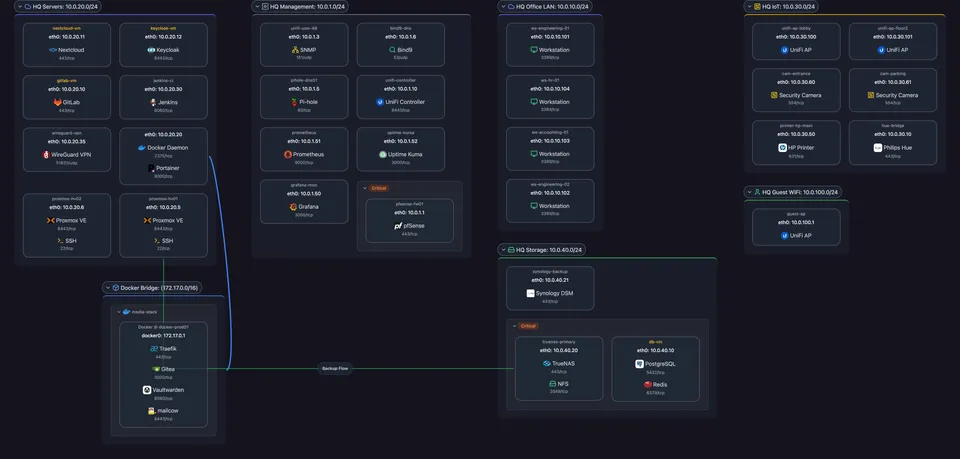
The opening screenshot is that network in the old single view. Here is the same network in the rebuilt renderer's L3 view: subnets as containers, with each host's addresses and services nested inside.
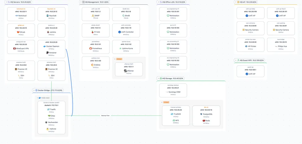
Collapse it to the Context level and each subnet becomes a single node with a count badge, the whole network on one screen.
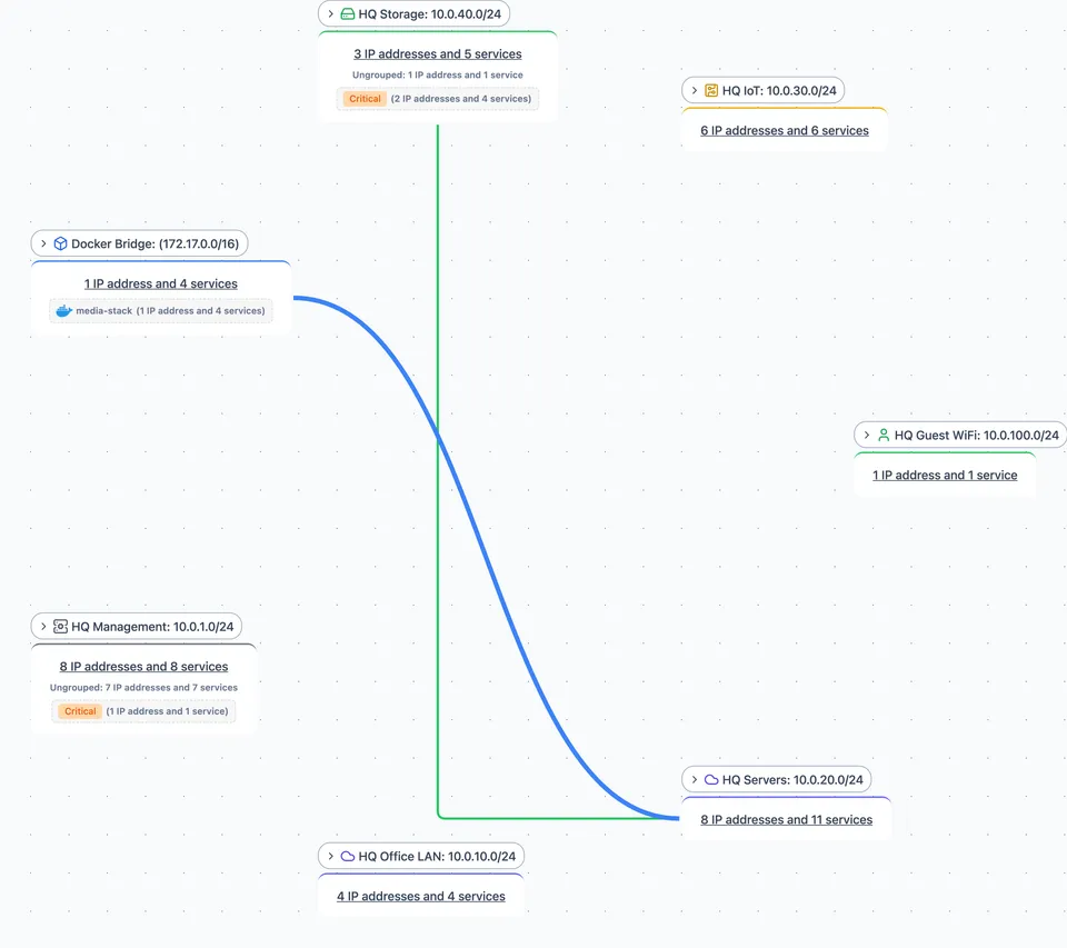
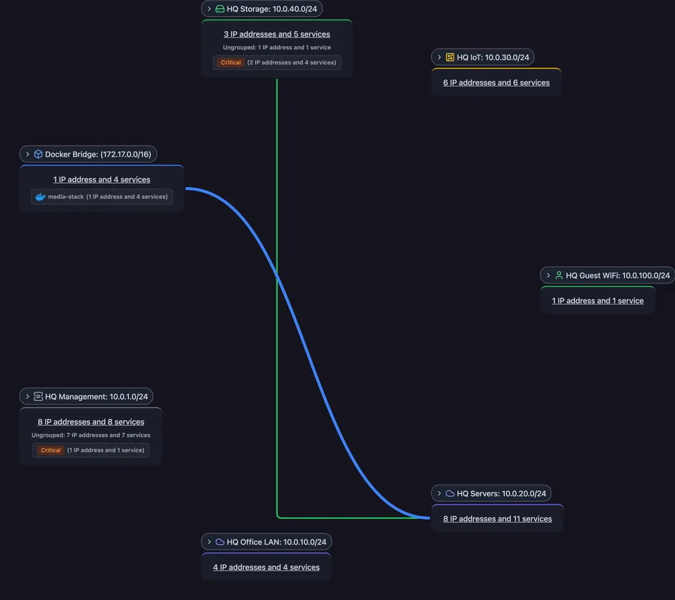
The layouts differ because the questions differ.
Here it is live, not a screenshot: an interactive Scanopy map you can pan, expand, and switch views on.
Four Views, C4 Zoom, and Deterministic ELK Layout Shipped in v0.16
Four views (physical L2, logical L3, workloads, applications), C4-style zoom via expand/collapse, layout-driving edges separated from context edges (off by default), ELK layered and rectpacking layouts, force-directed only for the fully collapsed overview. The multi-view rewrite shipped in Scanopy v0.16. Topology snapshots followed in v0.17.0: they capture point-in-time network state, and a diff at the end of each scan reports what changed. Deterministic layout is what makes those comparisons readable.
The Community Edition is free, self-hosted, and AGPL-3.0 if you want to run it against your own network. The graph drawing literature cited above is worth your time even if you never touch our tool: most of what makes infrastructure diagrams bad was measured and explained decades ago.
Frequently Asked Questions
Why do network diagrams become unreadable as networks grow?
Edge crossings. Huang, Hong, and Eades (2006) found that crossings are the strongest predictor of graph reading errors, and Purchase (2002) found crossing minimization is the single biggest factor in readability. Tools that draw physical links, subnet membership, and service dependencies in one view pile up crossings until no structure in the diagram is legible.
What is the C4 model applied to network topology?
C4 is Simon Brown's four-level zoom for software architecture diagrams: Context, Container, Component, Code. Applied to networks, the levels become every top-level container collapsed to a single node, containers expanded to show their members, individual hosts with ports and services, and a full detail panel for one entity. Each level answers one question at one scale instead of all questions at once.
How does Scanopy decide which edges to draw in each view?
Each edge type is classified per view as either layout-driving or context. Layout-driving edges shape where nodes go; context edges render afterward, thinner and off by default. In the L2 view, physical links drive layout. In the L3 view, subnet membership is containment (an IP address nested inside its subnet), not an edge, and layout is driven by the links that tie a multi-homed host's addresses together. The applications view tiles service groups by size, so dependency edges render on top rather than deciding placement. Keeping unrelated edges out of the layout is what keeps each view clean.
Which layout algorithm works best for network topology?
The right algorithm follows from the view's structure. Scanopy runs ELK for every view and changes the algorithm per view: layered (Sugiyama-style) for the hierarchical L3 and workloads views, rectpacking for the application view, and layered left-to-right routed by switch port for the physical L2 view. A fully collapsed overview, where every container is a single node, switches to a force-directed pass.
Why not show L2 and L3 topology in one diagram?
They are different graphs over the same devices. L2 answers how switches and hosts are wired; L3 answers how the network is segmented into subnets. A link that matters in one view is noise in the other, and drawing both edge sets forces the layout to compromise on two structural questions at once. NetBox and SolarWinds separate these views too, likely for similar reasons.
When should containment replace drawn edges in a diagram?
Whenever the relationship is parent-child. Nesting a VM inside its hypervisor's container, or an IP address inside its subnet, shows the relationship spatially without adding a line to the diagram. Drawn edges are then reserved for relationships that cross the hierarchy, which keeps the crossing count down.
Started as a homelabber, now deep in SNMP MIBs, Layer 3 topology, and service fingerprinting - building the network documentation tool I wished existed.